Moving Average Alignment
Whether the averages are stacked in order is a yes-or-no reading that most charts in an advance eventually satisfy. How far apart they sit is the continuous one, and that is where the difference between charts lives.
One
Every SwingRoo analysis opens with a panel headed ① Price & Moving Averages, and the snapshot above it prints a row labelled SMA 5 / 20 / 60. The panel and the row hold the same three numbers, put to two different uses.
The three lines are simple means of the closing price over 5, 20 and 60 sessions. What a reader takes off them is the order they sit in and the distance between them.
Those two halves behave differently. The ordering resolves to yes or no, and in an advance most charts answer yes sooner or later; the spacing is a continuous quantity that lands on a different value for every chart.
That asymmetry is the whole article. A word that most charts in a batch satisfy separates very few of them, while a number running from a few percent to a quarter separates all of them.
The same panel also carries Bollinger(20), so two separately labelled readings reach the reader's screen side by side. Section four is where that arrangement matters.
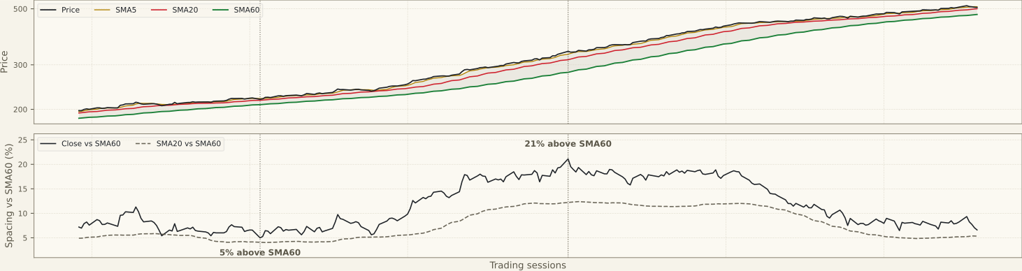
The figure is synthetic. One series was built so that the ordering holds on every session of the 99 shown, which leaves the spacing as the only thing in the picture that moves.
The lower panel is the argument. The distance from the close to the 60-session line reads 6% at the narrow marker, 16% at the wide one, and settles back near 7.9% by the right edge.
Those three figures are one chart at three moments, not three charts. All three are constructed, so they illustrate a shape rather than report a reading.
The upper panel is where the opening and closing happens, and the lower one is where it is measured. The two panels are not reading the same pair.
The band above is drawn between the fastest and slowest average; the panel below tracks the close against the slowest. The close travels further than the average of its own last five sessions, so the panel below reads wider than the band above looks.
Two
Two readings come off the panel and they are independent of each other. One is the order of the three averages; the other is where the most recent close sits among them.
The averages can be stacked in positive order while the close has already dropped under the fastest of them, because SMA5 still averages five sessions and one of those is today. Section three has an instance.
| Reading | What it says |
|---|---|
| Positive order, averages tightly bunched | Either a young advance or a range; the ordering has been satisfied without the price having travelled far |
| Positive order, spacing widening | The recent closes are pulling away from the older ones — the advance is doing the pulling, not the averages |
| Positive order, wide at the slow end, tight at the fast end | The move ran and then paused; the long gap is history, the short convergence is the present |
| Positive order, price far above all three | Distance travelled, described. The same reading is also the extension warning |
| Order breaking from the fast end | The most recent closes have fallen below their own short mean; the slower lines have not registered it yet |
| Negative order | Recent closes sit below older ones across all three windows — a summary of a decline that has already happened |
The six states above are combinations of those two readings and the spacing regime around them. Every row is read against the same chart's own history, which is the only reference the construction offers.
Spacing is tabulated nowhere on the analysis pages. The snapshot gives the three values and a plain-language line about where the close sits, and the distance between the averages comes off the chart by eye — part of why this page exists.
Three
Three ASX charts from the scan of 2 August 2026, same index, same publication date. The shared conditions are what make the comparison worth making — the chart is the only thing left varying.
Across the seven analyses published that day the ordering was the same in every one, SMA5 above SMA20 above SMA60. The spread between the close and the 60-session line ran from 5.1% to 25.6%.
That is an observation about a published set rather than a rule. Seven charts agreed on the word and disagreed by a factor of five on the number, and everything below is a reading of that gap.
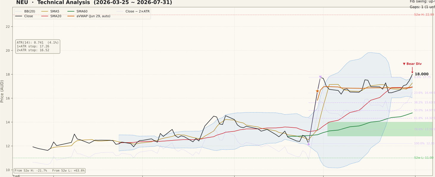
Neuren Pharmaceuticals is the most instructive of the three because its two ends disagree. SMA20 sat 14.6% above SMA60 while SMA5 sat only 2.0% above SMA20, with the $18.00 close 21.9% above the 60-session line.
The wide slow end records a move that has already happened. The tight fast end is the present, and it has stopped widening — one chart carrying two different reports depending on which pair of lines is read.
Viva Energy was the widest of the batch and wide at both ends. SMA5 10.7% above SMA20, the $2.85 close 25.6% above SMA60, and the spacing still opening rather than closing.
Data#3 is the pair to it, and the tightest. SMA5 1.9% above SMA20, SMA20 3.8% above SMA60, and the $9.76 close 5.1% above the 60-session line — four lines almost on top of one another.
Data#3 also carries the instance section two promised. Its close sat 0.6% under SMA5: the three averages were still in positive order while the most recent close had already slipped below the fastest one.
Set the pair side by side and the point of the article is one line long. Identical ordering, and 25.6% against 5.1% — five times the distance, measured.
That five is what one scan of one index happened to produce on one day. No figure was built to it and no constraint aimed at it, which is the property that makes it the useful number on this page.
Four
Six readings of this panel recur often enough to name. In each case the claim describes something the averages do not report, and the correction states what they report instead.
Positive order means the stock is in an uptrend.
It means the recent closes average higher than the older ones. Most charts in an advance satisfy the ordering at some point, which is why the ordering on its own separates very few of them from each other.
The ordering is the reading, and the gaps are decoration.
The ordering is one bit of information. The spacing is a continuous measurement, and two charts with identical ordering can sit 5% and 26% above their 60-session average — one word covering two charts that differ fivefold on the quantity it does not report.
Wider spacing means a stronger trend.
Spacing measures ground already covered relative to the slower windows. A wide gap is a description of distance travelled, which is also what extension looks like. Strength and extension are the same measurement read with different expectations.
A crossing of two averages is the event.
A crossing happens when enough new closes have entered one window to move it past the other. The closes that caused it printed sessions earlier, so the crossing reports a change rather than announcing one.
The average is a level the price respects.
It is a computed summary of prices, not a price at which anything traded. Price returning to it is the arithmetic of a mean being approached, and whether participants act on that is a separate question this page does not answer.
The Bollinger mid-band and SMA20 are two independent readings agreeing.
The middle Bollinger band is the 20-session mean. On these charts it is the same line as SMA20, drawn by two indicators, and counting it twice turns one observation into a false confirmation.
The second one is the reason this page exists, and it is easier to see than to describe.
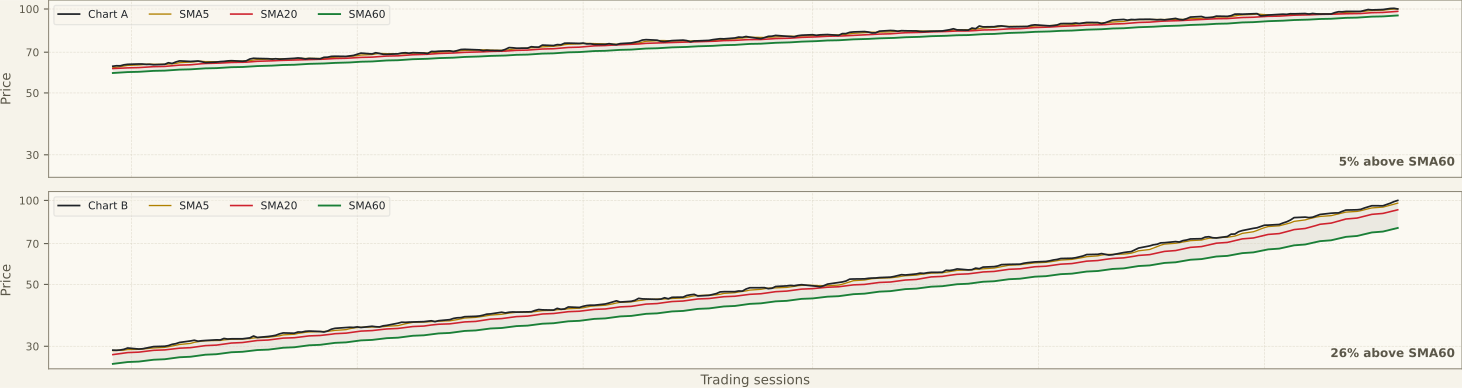
Two panels, two series, one moment. The last bar of each is in positive order, and it sits 5.0% and 26.0% above its own 60-session average.
Both of those figures are designed. The pair was built to a constraint of at least three times the spacing and aimed at five; the ratio between the panels came out at 5.20, which the caption gives as five times.
The two panels also start and end at the same value, 100.0 and 139.9. They made the same 39.9% over the window, so the difference in the last bar is not a difference in how much was made.
What differs is when it was made. Panel A gained steadily, and its last 35 sessions carry about a fifth of the advance; panel B spent most of the window flat and made nearly all of its advance in those same 35 sessions.
That is why B ends 26.0% above its slowest average while A ends at 5.0%. It is one measurement, and the two panels differ in what stands behind it.
So the 26.0% here and Viva Energy's 25.6% in section three are close for a reason that carries no information. One was constructed to clear a threshold, the other is what a single scan happened to produce.
The same care applies to the 5.0% in this figure and Data#3's 5.1%. The resemblance is deliberate — the synthetic pair was aimed at the range the ASX batch had already shown — so it confirms nothing.
This comparison is also a different kind from the one in section one. That figure was one series at three moments; this is two series at the same moment, which is why these two panels stand against each other and those three markers stand only against themselves.
The last of the six is the one the analysis pages set up by accident, since both labels appear on the same panel with equal billing. Counting two labels as two observations is the whole of the error, and the correction above gives the arithmetic.
Where the 5/20/60 triple comes from is recorded nowhere in this pipeline, and other triples appear just as often in published material. SwingRoo treats it as the charting convention it is, with no author attached to it.
Whether a faster average crossing above a slower one carries predictive value is an empirical question with mixed published results that depend on market, period and the windows chosen. This page leaves it open.
The account in which the averages behave as levels because many participants watch them is a proposed explanation. Nothing in this pipeline measures it, so it stays a hypothesis here rather than a mechanism.
Stage analysis is adjacent to all of this and built on different material — a 30-week average of weekly bars rather than a daily stack of three. The two frameworks answer different questions, and no ordering here maps onto a stage.
Five
The construction has limits that hold on any market, and they follow from the arithmetic rather than from where the shares are listed:
- SMA60 needs 60 sessions before it produces anything, so on a recent listing the ordering cannot be evaluated at all rather than being evaluated as negative.
- Every average here is an equal-weighted mean, so one unusual close moves the line when it enters the window and moves it a second time when it drops out. Part of what looks like a turn is the oldest bar leaving.
- Both readings are functions of closes that have already printed. Neither contains a claim about the next session.
- Dollar spacing is not comparable between charts and percentage spacing is. A one-dollar gap means something different on a two-dollar stock than on a twenty-dollar one.
- A gap or a suspension is absorbed into the mean like any other close. The averages keep computing straight through the event and smooth it away.
- The 5/20/60 triple is a choice. A different set of windows produces different orderings and different crossing dates on exactly the same chart.
The ASX adds weaknesses of its own, most of them a matter of what trades here and how often it trades:
- ASX halts are common on small and mid-caps and can run for days around a capital raising. The averages have no concept of a halt — the sessions pause and then resume, and the gap that opens on resumption is absorbed into the mean like an ordinary close. An ordering can change on the first session back for reasons that have nothing to do with the 60 sessions the line is supposed to summarise.
- Financials and materials dominate the S&P/ASX 200, and those sectors move together on macro news. Positive ordering across a basket of Australian large caps is often one sector-wide move showing up as several independent-looking charts, so agreement between them is weaker evidence here than the number of charts suggests.
- Below roughly A$2M of daily turnover a single large print can move a short average on its own, and move it back when it leaves the window. On thinly traded ASX names the 5-session line in particular describes one or two trades as often as it describes a trend.
- Australian yields are high and franking encourages large distributions, so the ex-dividend drop is proportionally bigger here than in most markets. SwingRoo uses an adjusted series, so the averages do not step on the ex-date. A reader comparing against an unadjusted chart elsewhere will see the short average bend for a reason that is purely a matter of how the series was built.
Analyses using this reading
- Neuren Pharmaceuticals (NEU) · 2 August 2026
- Viva Energy Group (VEA) · 2 August 2026
- Data#3 (DTL) · 2 August 2026
Last reviewed 6 August 2026