Mansfield Relative Strength
A measure of whether a stock is outperforming its own one-year relative trend — not simply whether it is beating the index. The distinction is the whole indicator.
One
Every SwingRoo analysis carries a Mansfield relative strength reading against the S&P/ASX 200.
Worth noting before anything else: we screen the S&P/ASX 300 but measure relative strength against the S&P/ASX 200. The screening universe and the benchmark are deliberately different indices.
The construction has two steps. First, divide the stock's close by the index close. That ratio rises whenever the stock outpaces the index and falls whenever it lags, in a rising market or a falling one.
Second — and this is the step that separates Mansfield relative strength from a plain ratio chart — compare the ratio to its own long-run average.
So the number is a percentage deviation from the ratio's own average, not a return. A reading of zero says the stock is performing against the index exactly as it has, on average, over the past year of sessions.
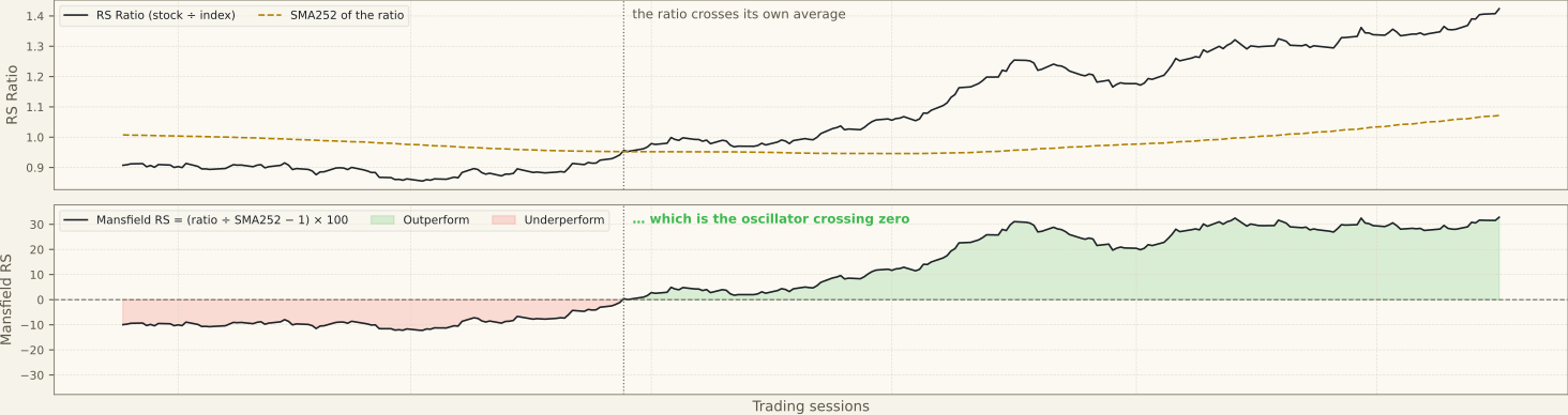
The averaging window is worth stating plainly, because it is why our figures will not match other charting platforms.
SwingRoo averages the daily ratio over 252 sessions — roughly a trading year — using a simple average, and a reading appears once 63 sessions of history exist.
Stan Weinstein's original charts, in Secrets for Profiting in Bull and Bear Markets (1988), averaged weekly bars over 52 weeks. The measure takes its name from the Mansfield Chart Service, whose weekly charts carried it. Same idea, different sampling.
In Weinstein's framework the measure is a filter rather than a standalone reading. He looks for a stock entering a stage 2 advance and showing relative strength above zero, and treats a chart that breaks out without the relative strength confirmation as the weaker of the two structures.
Two
The level matters less than two other things: which side of zero the reading sits on, and which way it is moving.
| Reading | What it says |
|---|---|
| Below zero, falling | Lagging, and lagging worse than its own one-year average |
| Below zero, rising | Repair under way — a laggard beginning to turn |
| Crossing zero | The Weinstein signal; strongest when it coincides with a base breakout |
| Above zero, accelerating | Leadership — money rotating in faster than into the index |
| Above zero, flattening | Leadership maturing; the edge is no longer widening |
| Far above zero | Extended against its own average — same mean-reversion logic as price far above SMA20 |
Slope is the part most often skipped. A stock at +12% that has climbed there from +2% a month ago is in a different condition to a stock at +12% that has drifted down from +30%, even though the snapshot figure is identical.
That is why our analyses quote the prior week and prior month alongside the current number rather than the number alone.
Three
Viva Energy in the week to 31 July 2026 came close to the textbook version of the sequence Weinstein describes.

VEA had spent more than a year below zero. Relative strength crossed the line in March 2026 and then steepened sharply — +2.0 a month before the close in question, +20.0 a week before, +33.2 on the day.
Price followed afterwards: the April high at $2.64 had capped the stock for three months, and the late-July thrust cleared it, closing within 0.7% of the 52-week high.
The order is the point. Relative strength turned first and price confirmed second. That sequence — accumulation showing up in the ratio before it shows up in the price chart — is why the measure earns a panel of its own rather than a line in a summary table.
For contrast, Bega Cheese read +4.3% in the same week. Positive, but only just. Above zero is a threshold rather than a grade, and a marginal positive reading sits closer to neutral than to leadership.
Sonic Healthcare that week showed the third state on the table above: still below zero, but rising — a laggard in repair that had not yet crossed.
Four
Four readings of the number recur often enough to be worth naming. In each case the claim describes something the measure does not report, and the correction states what it reports instead.
RS +33.2% means the stock beat the index by 33.2%.
It is deviation from the ratio's own 252-session average, not a return differential against the index over any period.
Positive RS means the price is going up.
RS is purely relative. In a falling market a stock can hold positive RS while losing absolute value, because it is falling more slowly than the index.
Higher is always better.
An extreme reading means the ratio is stretched far above its own mean. That is a strength signal and an extension warning at the same time.
RS readings are comparable across charting platforms.
Implementations differ in sampling and scaling — the averaging window described in section one is one example. The same stock on the same day will read differently depending on which is used. Compare readings only within one data source.
The second of those is the one to look at rather than take on trust, because the two panels below disagree in a way that is entirely consistent.
The stock falls for the whole window; the relative strength reading stays above zero for the whole window. Both are describing the same sessions. One is measuring the stock against its past prices, the other against the index.
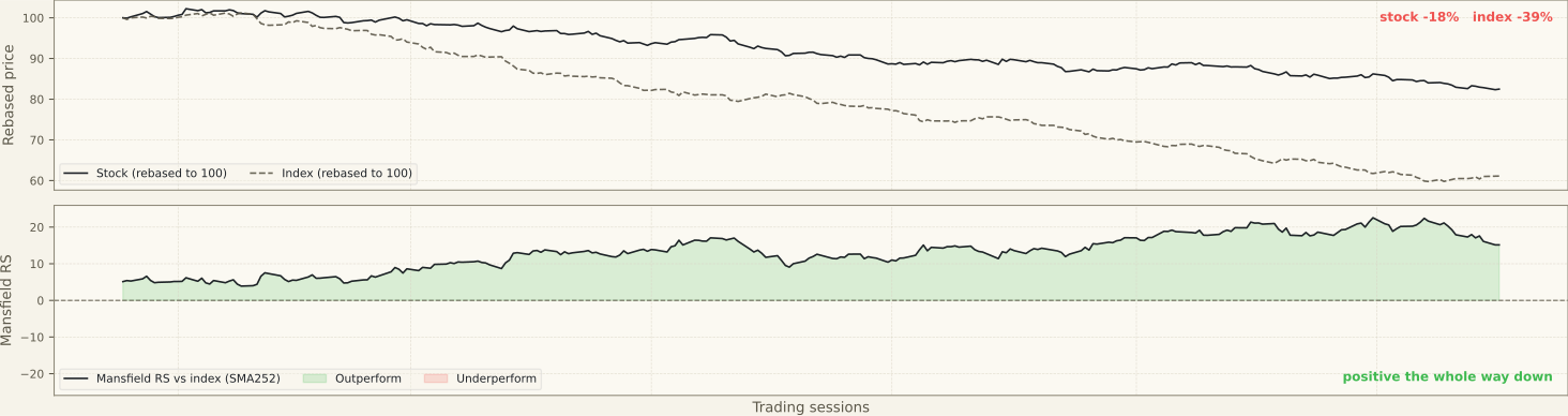
Read together with the price and moving-average panels, a positive reading in a falling market tells you where the money went when it left the index.
On its own it describes what has already happened to the ratio, and nothing about what follows.
Five
The measure has structural limits that apply on any market:
- A reading appears after 63 sessions but the average is not full until 252. Between those points the figure is a deviation from a short average, so extreme readings on recent listings are unreliable rather than meaningful.
- Lagging by construction — a 252-session average smooths recent change.
- Benchmark choice changes the answer entirely.
- Says nothing about absolute return; a portfolio of high-RS stocks can still lose money in a bear market.
- Thin, illiquid names produce an erratic ratio and an unreliable reading.
And it has specific weaknesses on the ASX, which are mostly consequences of the benchmark being small and top-heavy:
- The S&P/ASX 200 is heavily concentrated in financials and materials. Measuring a major bank or a large miner against it is close to measuring a sector against itself, so a flat reading on CBA or BHP carries less information than the same reading on an industrial or healthcare name. For resources stocks, a sector benchmark is the more honest comparison.
- With roughly 200 constituents against thousands in the US, ASX relative strength rankings are far more sensitive to a handful of large moves. A stock can climb the RS rankings because two or three index heavyweights fell, not because it strengthened.
- Outside the ASX 200 the ratio becomes erratic on thin turnover. Junior resources names in particular can print extreme RS readings driven by a single low-liquidity session, and trading halts leave gaps in the series.
- The ASX opens after the US close, so both the stock and the index absorb the same overnight shock at the same time. This mostly cancels out in the ratio, but a stock with US-listed peers or ADR exposure can show a one-day RS distortion after a large Wall Street move.
Analyses using this reading
- Viva Energy Group (VEA) · 2 August 2026
- Bega Cheese (BGA) · 2 August 2026
- Sonic Healthcare (SHL) · 2 August 2026
Last reviewed 4 August 2026